
Unilever Mobile Chef
2014
An IOS app used for demonstrating Unilever products to restaurants or other catering food stores, and can also be used as Unilever sales representatives to plan/record their daily visiting plan ,and manage their customers info etc.
This app was designed by me in 2014 when I was working in Accenture as a Sr. UX designer, the goal of this app is to
help Unilever sales force to better present their products to restaurants or other catering industries.
According to Unilever sales representatives' (will use ’they’ in the following paragraph) real daily working process, this app mainly
covered 3 functional aspects:
1.(Pre-call) Before they visiting their customers, they can use this app to create/edit customer info, plan their daily/weekly visiting
plan and getting the best visiting route automatically;
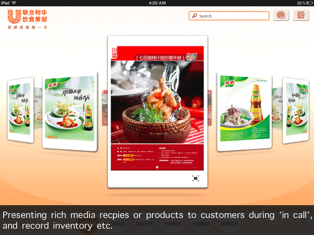
2.(In-call) During their visiting, they can use this app to present rich media to customers such as Unilever new product info, on
going promotions, cook recipes. And they can also record inventory, type in orders or fulfill questionnaires etc;
3.(Post-call) After visiting, they can use this app to upload their records/orders, review KPI or browse company news etc.
Design solution
Two-UI-sets based on sales force visiting process
When this app is used for presenting rich media to customers (during in-call), the visiting plans or the KPI info of sales force
should not be shown on any circumstance. So based on this consideration, I thought outside the box and designed two different
UI sets and combined them in this one app.
The switch gesture between these 2 UIs is elegant and rare in mobile app design ---- 3-finger-tap on Unilever brand icon.
Because only in this way, the sales force will have no worries to handle the iPad to customers, and the customers will have no
acknowledge of the ’before visiting’ and ’after visiting’ part.
Data sorting
It’s always common challenge for designer to sort and display massive data in an elegant and clear way, especially text
editing on a touch screen is difficult. I made the data transferring on this app easy-to-understand and friendly-to-edit.

Functional flow & Architecture design
