Open Scape
Mitel/Unify Collaboration
Web App Redesign
UX Lead 2023

Brief Intro:
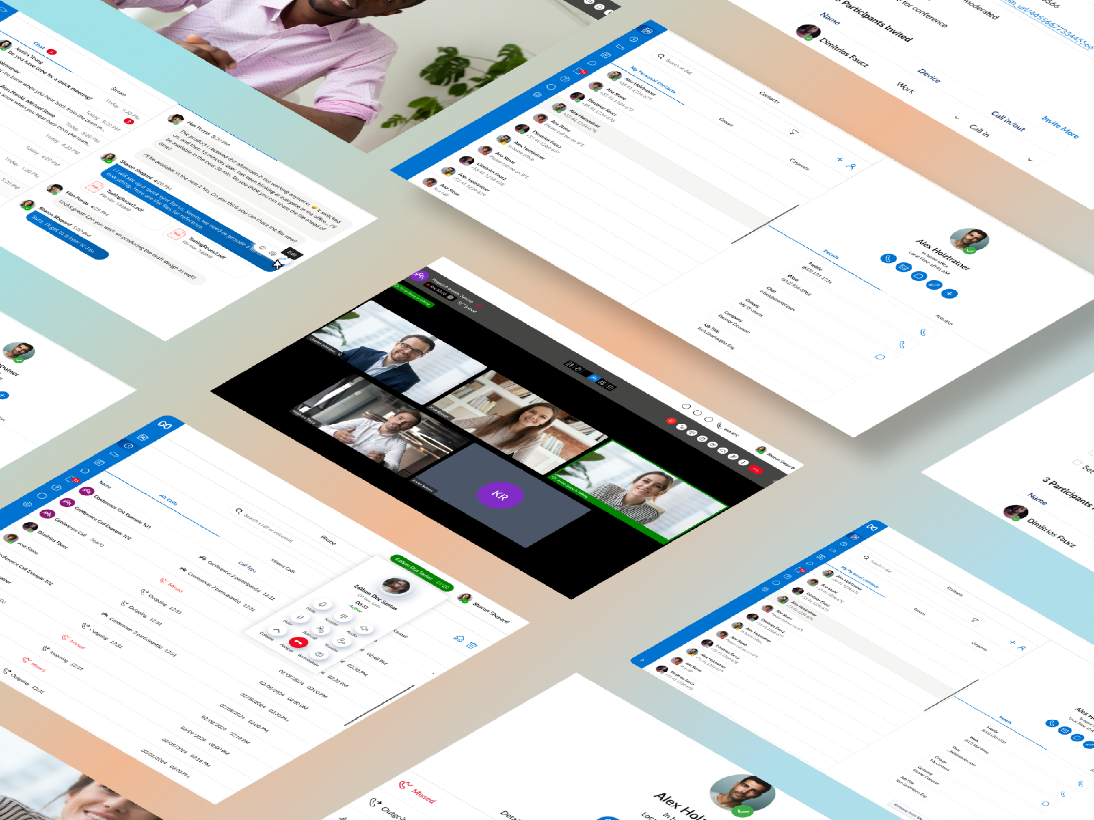
By leveraging design critique on old product and engaging closely with VARs (Value-Added Reseller) and product managers, I renovated the Mitel's OpenScape collaboration service and transformed it into a modern web application that delivers an enhanced and delightful user experience.
Background Info:
Unify is a Germany company which provides software based enterprise unified communications including voice, web collaboration, video conferencing and light contact center product and services. One of it’s primary product is an unified communication application called Open Scape.
After Mitel acquired Unify in Oct 2023, I was entrusted as UX lead for the revamp of this product. My focus was on modernizing the application and aligning it with Mitel’s visual language, all while driving key functional enhancements under the constraints of resources and timelines.
Painpoints & Challenges:
Open Scape was an aging enterprise collaboration application that mainly served small to medium-sized businesses, faces significant UX challenges stemming from its outdated design, technological limitations, and lack of ongoing maintenance.
To address these challenges, I conducted a thorough design critique, engaging in in-depth discussions with channel vendors and the product manager. These conversations provided valuable insights into customer feedback and suggestions, which I meticulously documented. Leveraging that research, I identified the key pain points and established critical objectives for enhancing the user experience:
1.Outdated User Interface:
The current interface is not only visually outdated but also fails to provide an intuitive user experience. The lack of modern design principles results in a steep learning curve and impairs user productivity. A complete UI overhaul is necessary to enhance usability, aesthetic appeal, and overall user satisfaction.
3.Lack of Integration:
The platform’s lack of integration with essential tools such as calendars, enterprise directories, and CRM systems creates disjointed workflows. Users are forced to switch between different applications, leading to inefficiencies and decreased productivity. Addressing this gap by implementing seamless integrations is vital to streamlining workflows and enhancing the platform's value proposition.
2.Poor Information Architecture:
The navigation and information structure were confusing, makes it challenging for users to locate essential features and content. Redesigning the navigation and information hierarchy is crucial.
4. Inadequate Accessibility Support:
Accessibility features within the platform are incomplete, with significant gaps especially in keyboard navigation and assistive technology support. This exclusionary design limits usability for individuals with disabilities and fails to meet modern accessibility standards. Improving accessibility is essential to making the platform more inclusive and compliant with industry best practices.
5. Limited Search Functionality:
The absence of a robust, universal search feature is a significant shortcoming, frequently cited by customers. Users need an efficient search tool that can quickly surface relevant content across messages, meetings, and contacts.
Deliverables:
-
Old Product Design critique
-
Ideation sketches and explorations
-
Design strategy
-
User flows
-
Low-fidelity prototypes
-
Iterative updates design
-
High-fidelity prototypes
-
Documentation
Design Thinking Examples:
I. Contacts:
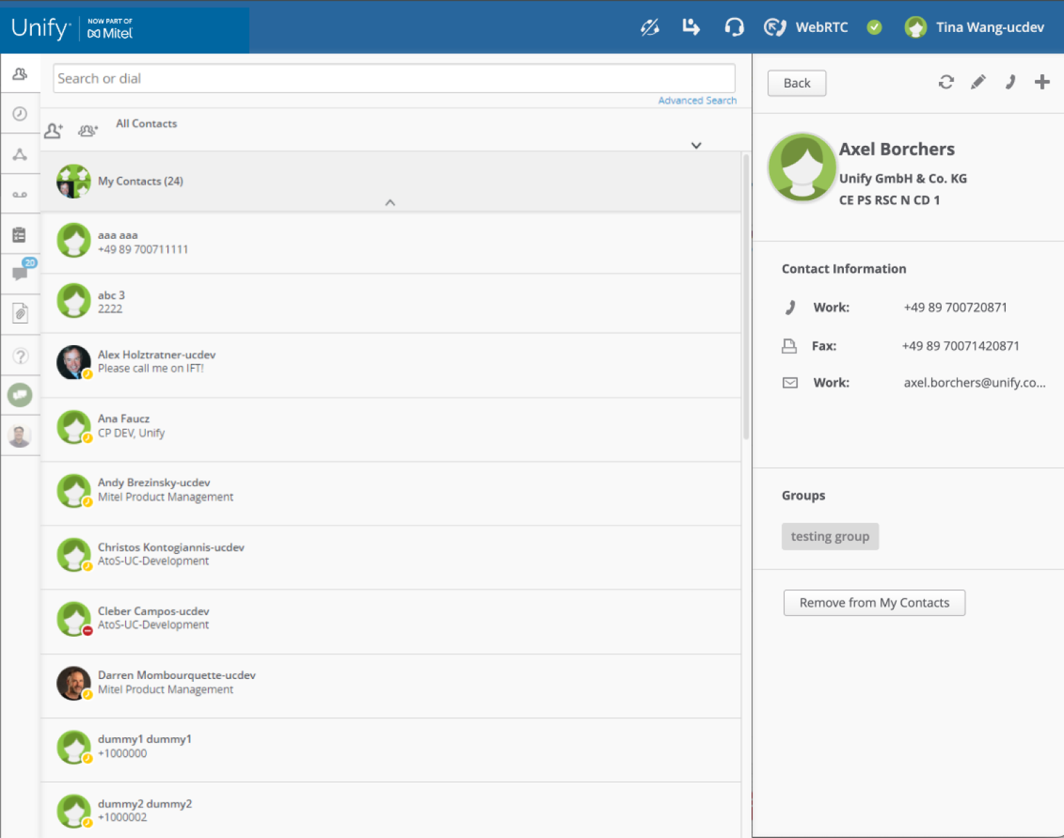
Contacts (Previous)
Contacts (Proposed)
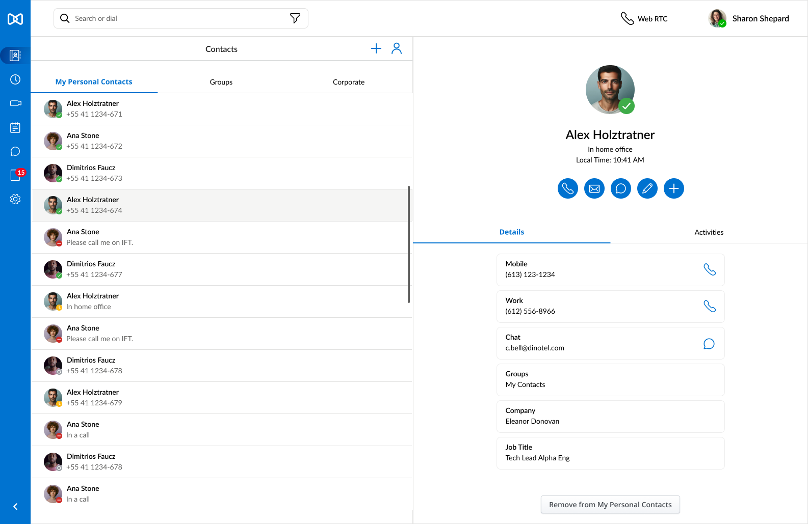
Contacts (Proposed)
Contacts Design Strategy
1. Leverage Mitel’s Atomic Design Library:
Adhere to Mitel’s newly established design components, utilizing standardized colors, typography, icons, and basic structural layouts to ensure consistency and coherence across the platform.
3. Relocate the “Contacts” Tab:
Instead of keeping the “Contacts” tab docked on the right side, repositioning it as a primary navigation item will create a more intuitive and cohesive user experience.
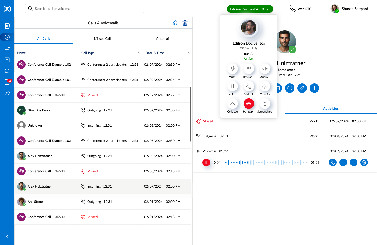
5. Design an Informative Contact View:
Develop a more comprehensive contact information view, incorporating an “Activities” section that aggregates all related interactions—such as calls, voicemails, messages, and files—into a single, easily navigable interface.
2.Enhance Visual Hierarchy:
Prioritize key actions such as adding, calling, messaging, and editing contacts by making these elements more prominent and easily accessible, thereby improving the overall information hierarchy.
4. Implement Global Search:
Replace the local search function with a powerful global search capability, enabling users to efficiently find relevant content across contacts, messages, and meetings, thus streamlining navigation and information retrieval.
6. Sync with Outlook Contacts:
A new integration with Outlook Contacts will allow for automatic synchronization and bulk importing of contacts into the OpenScape directory, simplifying contacts management.
7. Accessibility Compliance:
Increase font sizes and enhance the contrast ratio to meet accessibility standards, ensuring the platform is usable by individuals with varying levels of ability.
II. Calls:
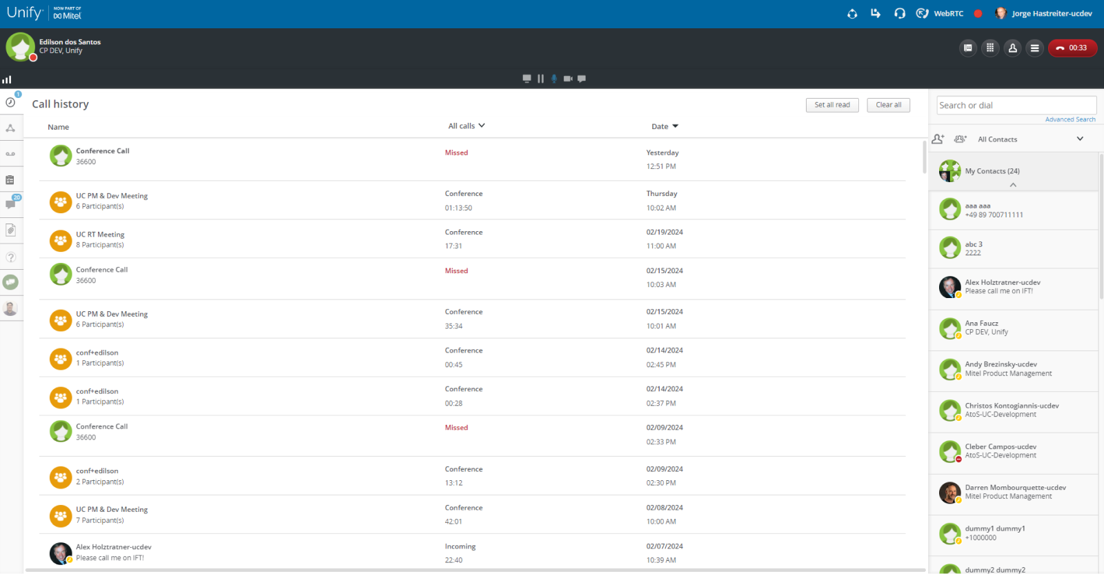
Calls (Previous)
Calls (Proposed)
Calls - multi call stack (Previous)

Calls - multi call stack (Proposed)
Calls Design Strategy
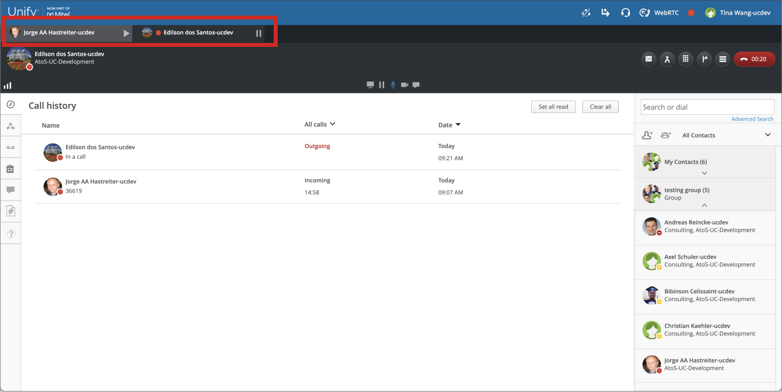
1. Optimize Active Call Placement:
Instead of displaying a black bar across the entire application, which reduces valuable vertical space, repositioning the active call interface as a popup that users can easily fold or unfold based on their needs. This approach preserves the main content area while ensuring quick access to other functions within the app.
2.Streamline Call Actions:
Previously, call actions were scattered across various locations, complicating the user experience. I’ve restructured these actions into a more cohesive grouping that aligns with the user’s mental model, simplifying interaction and ensuring that the right controls are easily accessible when needed.
3. Enhance Multi-Call Management:
The previous design for handling multiple simultaneous calls was cluttered and lacked intuitive navigation. To address this, I’m redesigning the interface using an accordion layout within the call popup, allowing for a more efficient use of visual space and making it easier for users to switch between different calls seamlessly.
III. Meetings

Meetings (Previous)
Meetings (Proposed)
Meetings Design Strategy
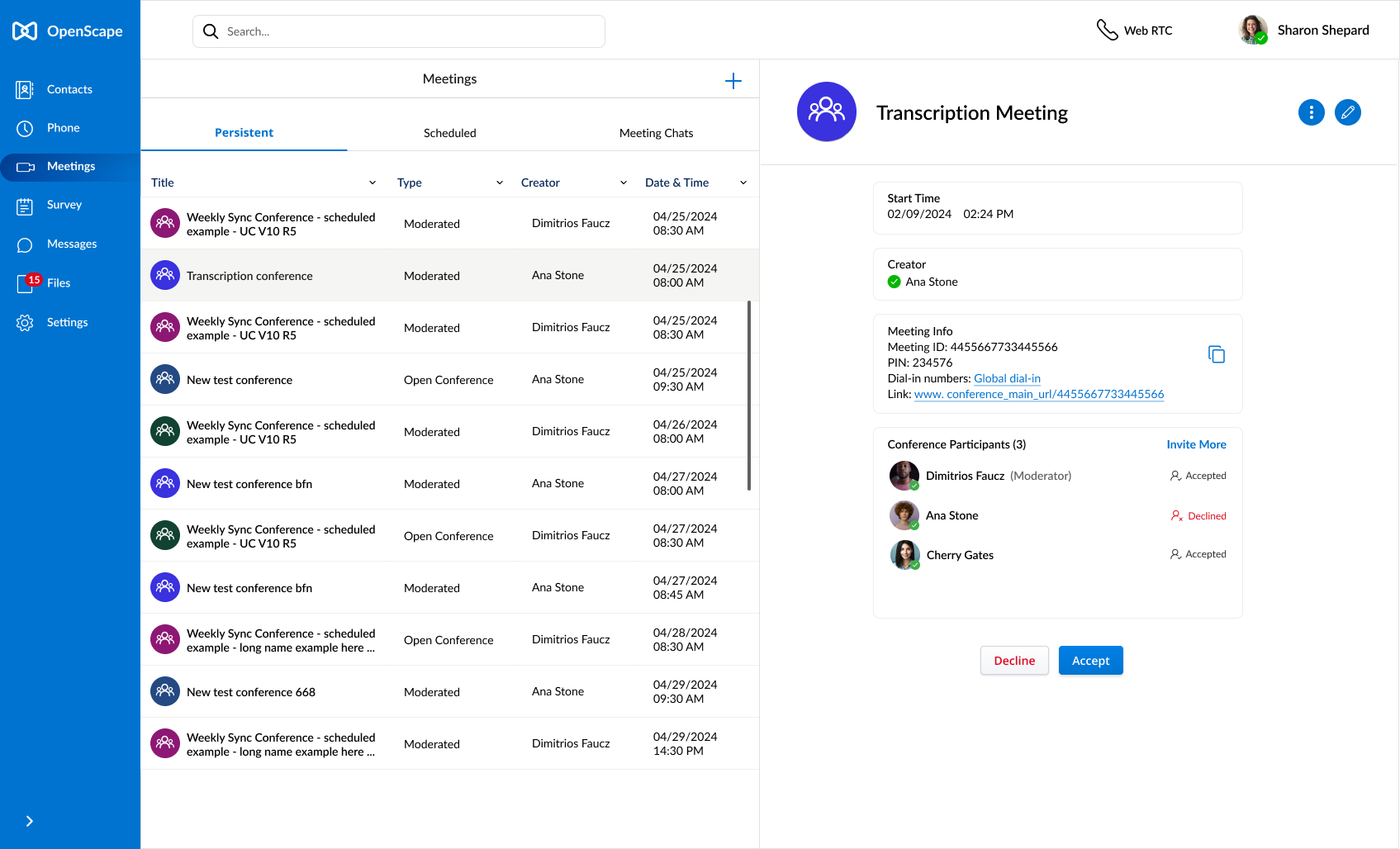
1. Optimize Meeting Details Placement:
Instead of showing the fixed “contact” always on the right, the new split-screen view allows users to quickly switch between different conferences while instantly viewing meeting details, enhancing workflow efficiency.
2. Integrate with Google Calendar and Outlook Office 365:
To streamline the user experience, integrated Google Calendar and Outlook Office 365 is a “must-have”, ensuring that meetings across all platforms are synchronized, thus maintaining a cohesive and up-to-date schedule within the application.
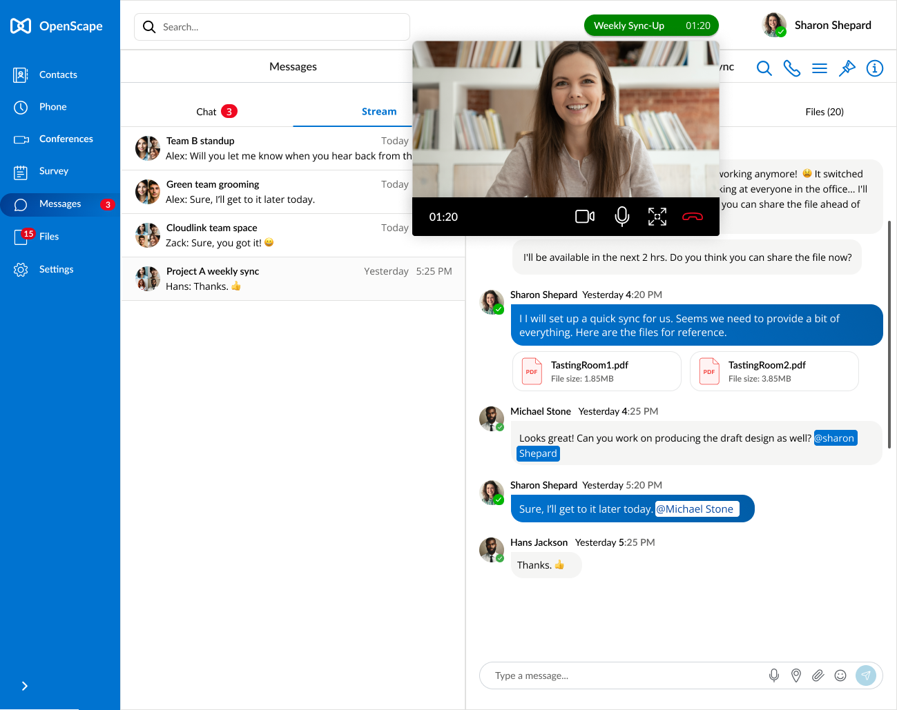
IV. Chat
Chat list (Previous)
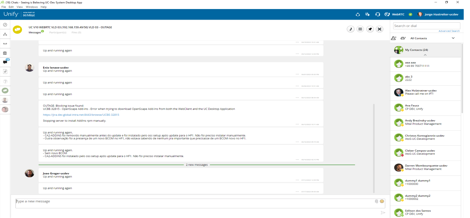
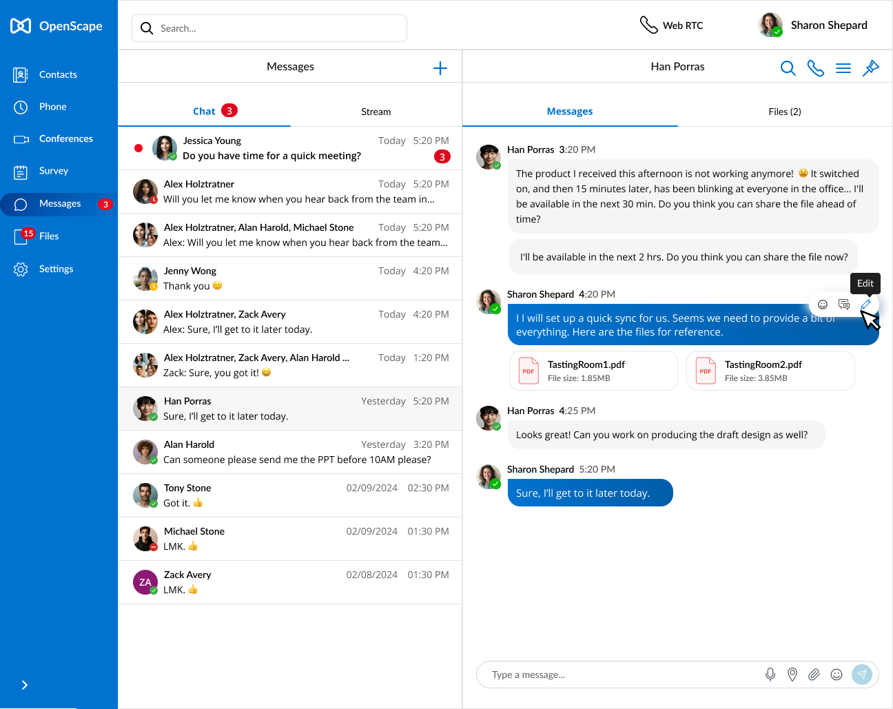
Chat (Proposed)
Chat conversation detail (Previous)
Chat Design Strategy
1. Optimize Chat Details Placement:
Instead of showing the fixed “contact” always on the right, the new split-screen view allows users to quickly switch between different conversations while instantly viewing chat details, enhancing workflow efficiency.
3. Improve Readability:
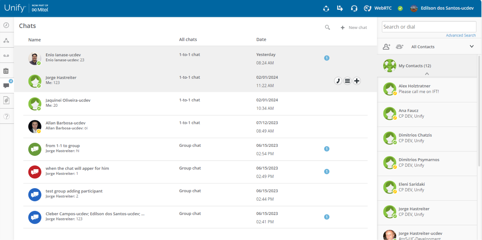
To optimize readability, I’ve limited the length of message previews in each row. This design choice prevents text from becoming overwhelming and ensures that each message remains clear and easy to scan.
2.Enhance Visual Emphasis on New Chat Badges:
To draw users’ attention to unread messages, I’ve introduced a red badge indicator for new chats. This visual cue effectively highlights important information, ensuring that users don’t miss critical updates.
4. Differentiate “Chat” and “Stream”:
Recognizing the distinct nature of “chat” (or “message”) and “stream” (or “channel”), I’ve separated them into two distinct tabs. Chats represent traditional conversations between two or more users, while streams offer a continuous flow of updates organized around specific topics. This separation aligns with majority users’ mental models and improves the efficiency of information access.
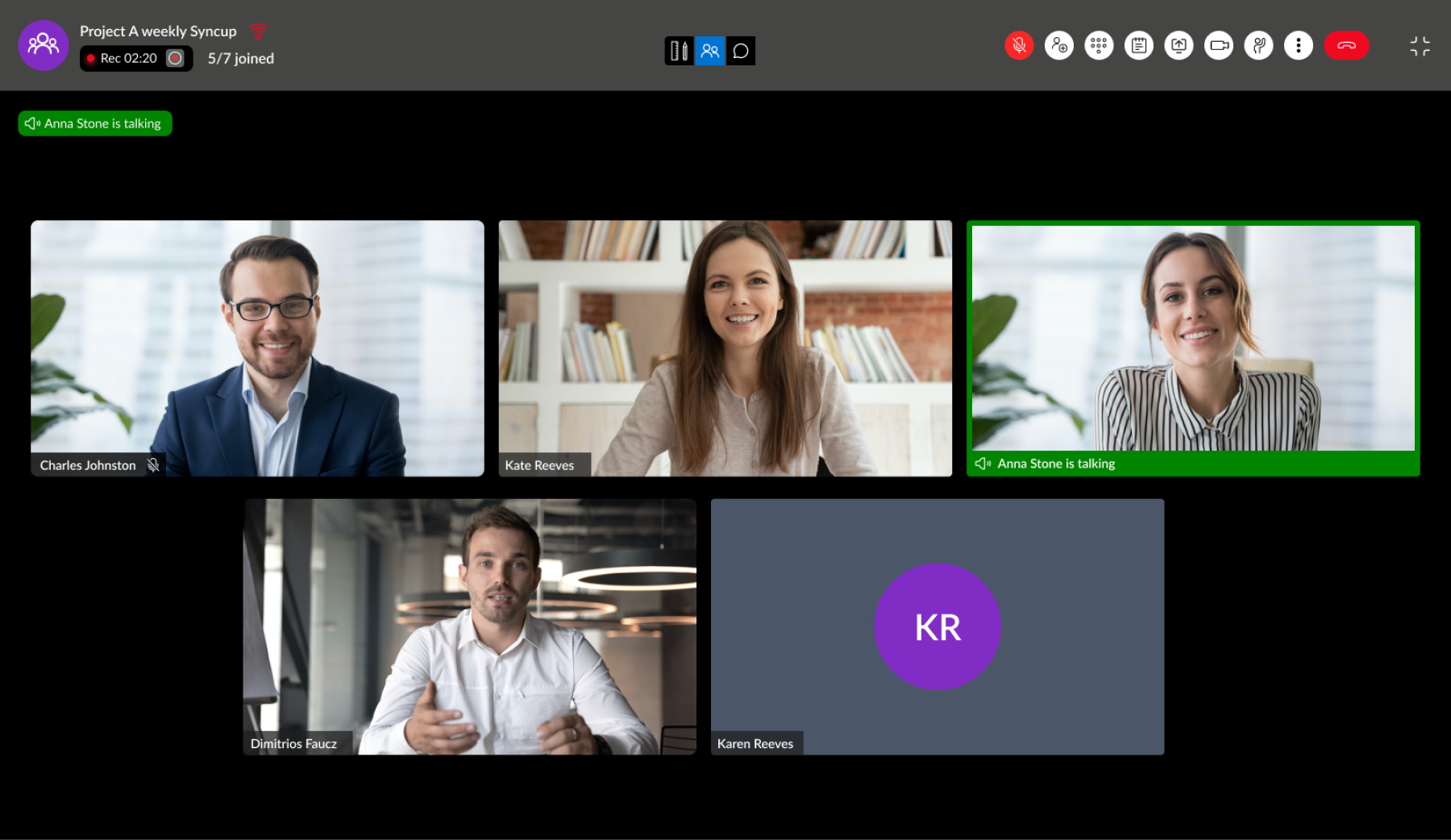
V. In-Meeting

In meeting (Previous)
In meeting (Proposed)

In meeting - artboard / screen share (Previous)
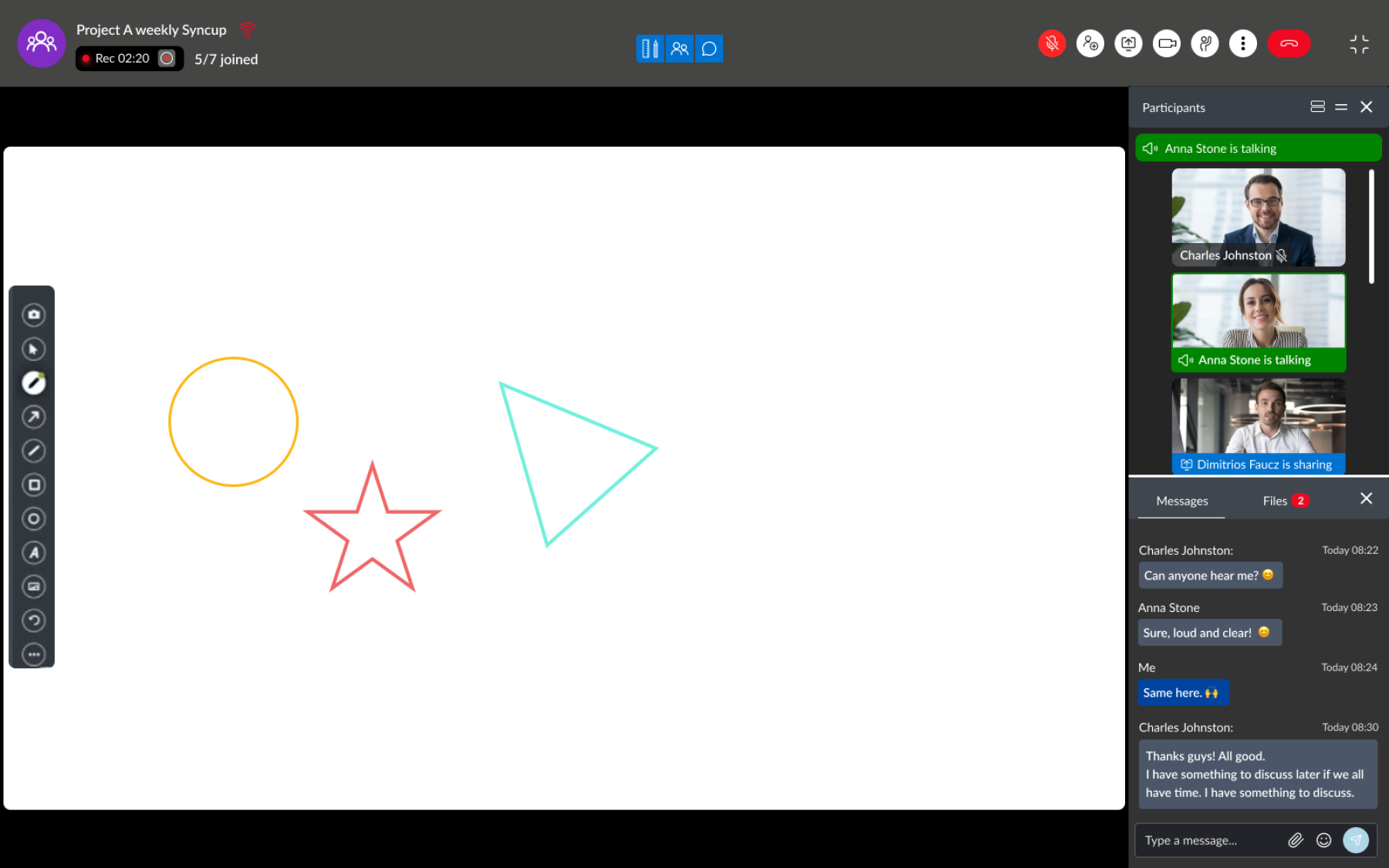
In meeting - artboard / screen share (Proposed)
In meeting - minumim view (Proposed)
In Meeting Design Strategy
1. Optimize Vertical Space Utilization:
To maximize vertical screen real estate, I’ve optimized the header section, making it more compact and efficient. Additionally, I’ve implemented an auto-hide feature that reveals the header only when the user’s mouse is in motion, ensuring a cleaner and more spacious interface.
2. Streamline Secondary Information Display:
In the previous design, secondary information such as the participant list and active talker indicators were displayed alongside the main screen share content, leading to a cluttered interface. The chat bubbles further contributed to the disorganization. I’ve restructured the in-meeting information layout, integrating these elements more cohesively and prioritizing the screen share content, thereby enhancing focus and minimizing visual distractions.
3. Enable Flexible Meeting Display in Minimal View:
Recognizing the need for multitasking during active meetings, I’ve designed a minimal view option that displays the ongoing meeting in a popup. This allows users to seamlessly switch between tabs and manage other priorities while still keeping track of the meeting’s progress.